Blooming Art
Blooming Art
Photography: Orsolya Karancz
Flower design: Petra Radnai
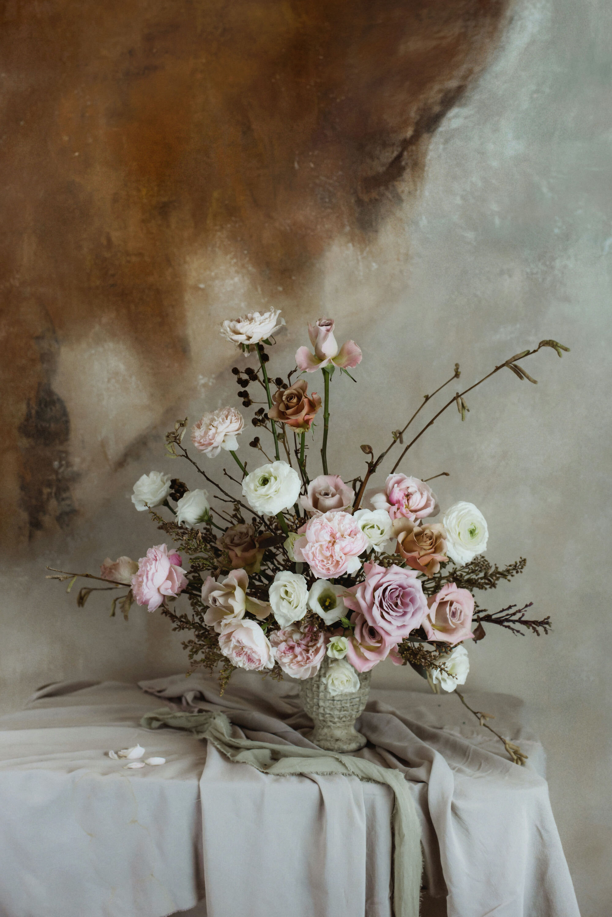
Blooming Art is a series of floral paraphrases by Petra Radnai & Orsolya Karancz. To bring additional meaning to each piece, Petra reflected on the style of the original paintings and used various compositions. In addition, she chose the flowers based on the personality of characters she was imitating. "I had to focus on three things during the process: backgrounds, lighting and post-production. The goal was to create a context for each piece with painted backgrounds. I was lighting each floral composition similar to characters in the paintings. For a final touch, I edited the brightness, colours and textures of the photographs, comparing to original paintings."
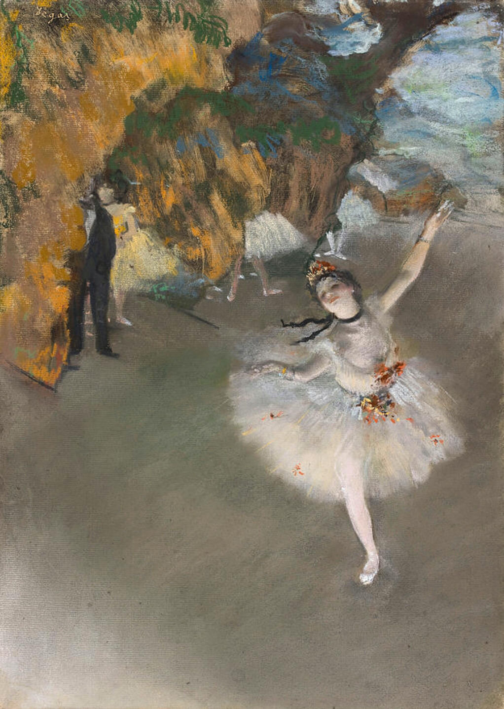
STAR OF THE BALLET
EDGAR DEGAS, 1878
Art history: Degas loved to feature dancers in his paintings. Star of the Ballet, portraying Rosita Maurit is a pastel created with monotyping. Monotypes are imprints of a drawing originally created on a copper or glass plate and then transferred to a sheet of paper by pressing the two surfaces together. Star of the Ballet was showcased on the third exhibition of the impressionists. The painting is realistic and supernatural at the same time. The playful lights and the original perspective contribute to the extraordinary effect. Behind the scenes dancers and a man are watching the prima ballerina. They are merely torsos without heads, the painting focuses on the ballet dancer, who graciously bows in front of the audience.
Floral design: When creating the flower arrangement, we wanted to reflect on the aerial lightness of Degas’ ballet dancer by choosing soft-petalled David Austin roses, Ranunculuses and Lisianthuses. The location of the flowers and the structure of the composition marks the charming and dynamic movements of the ballerina, with her gracious hand position outlined by the arch of a hazel branch. During post-processing, we desaturated the colours to create a softer, pastel effect and increased contrast and grain to achieve a texture resembling the painting.
Lighting: As a theatrical scene the composition is angled upwards, therefore, we took the
photo from above. It is illuminated from below, at the height of the imaginary stage.
Two lamps are lighting the arrangement from the bottom right and we also brightened the
flowers slightly. During post-processing, we desaturated the colours to create a softer,
pastel effect and increased contrast and grain to achieve a texture resembling the painting.
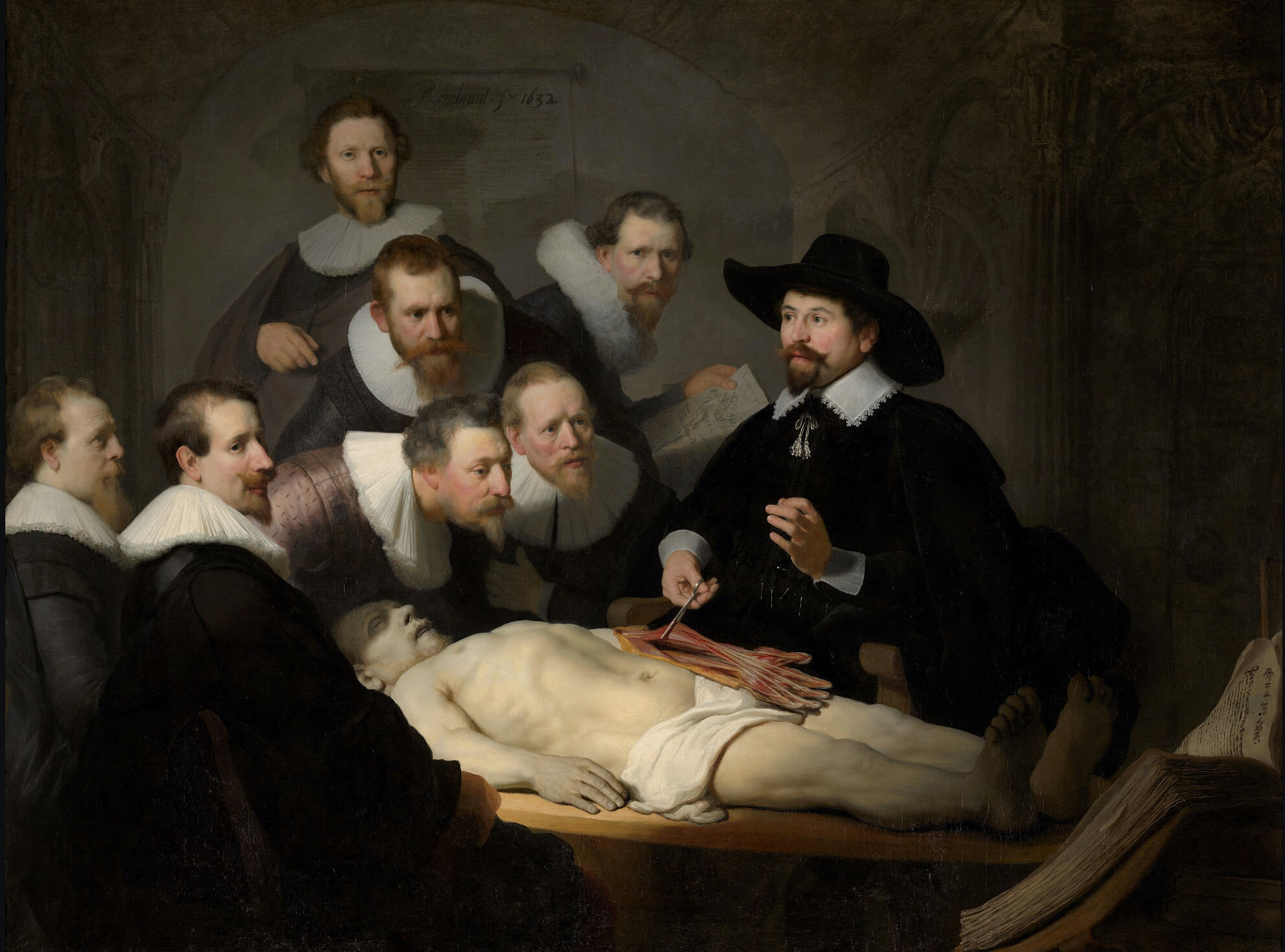
THE ANATOMY LESSON OF DR. NICOLAES TULP
REMBRANDT H. VAN RIJN, 1632
Art history: In the 17th century, anatomy lectures were open door events attended by doctors, medical students and other visitors. The painting depicts a public autopsy organised on 31 January 1632 and conducted by Dr Nicolaes Tulp, the anatomist of Amsterdam. The city permitted only one public autopsy per year for which they used the body of an executed criminal. Rembrandt was commissioned by the Guild of Surgeons in Amsterdam to capture the event and every figure in the painting paid a fee to the artist to be featured in the masterpiece.
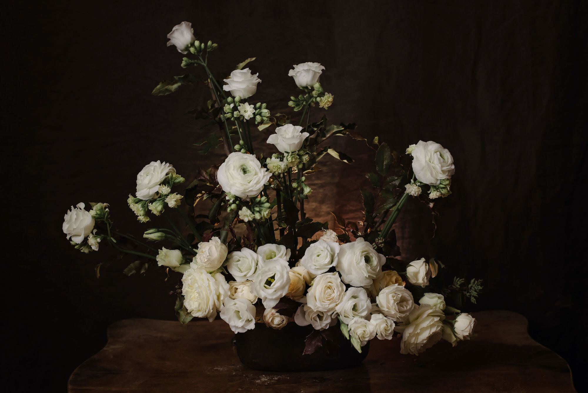
Floral design: We tried to capture the play of light and shadows, a characteristic of Rembrandt, while creating the flower arrangement. We stuck the flowers in a dark stone bowl and put the composition in front of a dark background. The dead body in the centre of the painting is marked by thick-blossomed cream and white roses, creating a homogenous, united structure close to each other. We only used white flowers for the figures observing the dead body: Ranunculuses in the foreground and smaller-headed Lisianthuses for the background. The collars of the doctors are outlined by Kalanchoes.
Photography: We recreated the distinctive lighting painted by Rembrandt. The main light source and the brightening was based on the original, while reflecting on the soft,
slightly hazy atmosphere, so we utilised incense-burners to thicken the air and create unique lighting conditions. We focused on Rembrandt’s subtle and soft brush technique and the marked difference between light and shadows. We increased contrast and softened the picture, while reducing clarity.
IN THE CAFÉ
ISAAC ISRAËLS, 1865 - 1934
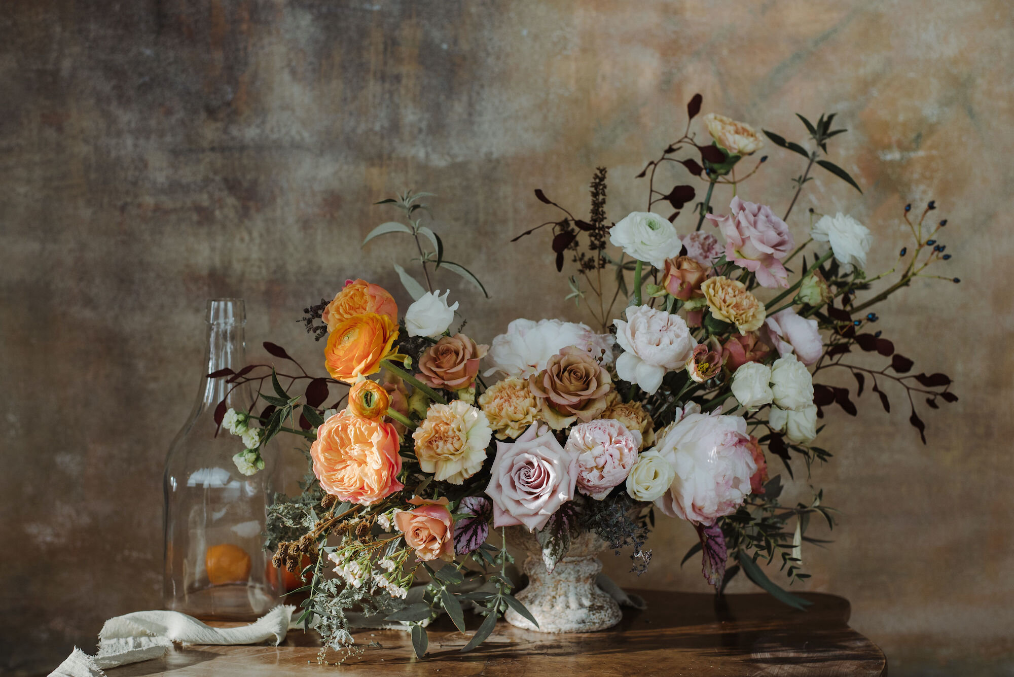
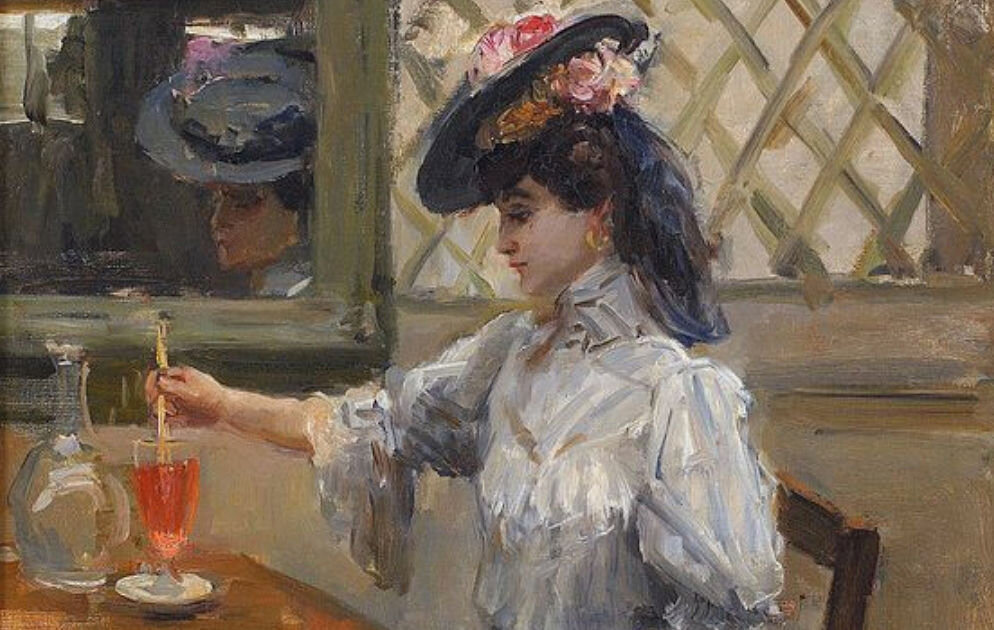
Art history: Besides Van Gogh and Mondrian, Isaac Israëlst is considered to be one of the greatest figures in the Dutch modern history. He loved to submerge in the vibrant and colourful world of streets, clubs, music and dance cafés, fashion and the life of Amsterdam. His main aim was to capture the present moment quickly. In case of this café scene, we worked with the whole composition including the focus on the moment, the brush technique and the spectacular colour dynamics.
Floral design: When selecting the flowers and creating the arrangement, we mainly concentrated on the vibrant light and small brush strokes characterising the impressionist painting style. The swirling colours of the original painting are reflected by the flowers. The orange of the lady’s drink in the painting is marked by unique, strong yellow of Ranunculuses and Juliet roses.
Photography: The painting depicts the interiors of a room with light coming in from the top left corner. We illuminated our arrangement the same way with a lamp and softly brightened the flowers from the opposite side. The light also penetrates the orange liquid in the glass, therefore, we let some natural light into the room to emphasise the orange flowers. Our aim was to showcase the bold brush strokes characterising impressionist artists, which are bright spots rather than contour lines. We slightly increased the contrast of the picture to accentuate these spots. At the same time we reduced noise and created a unique texture marked by soft grain.
MADAME RÉCAMIER
JACQUES-LOUIS DAVID, 1800
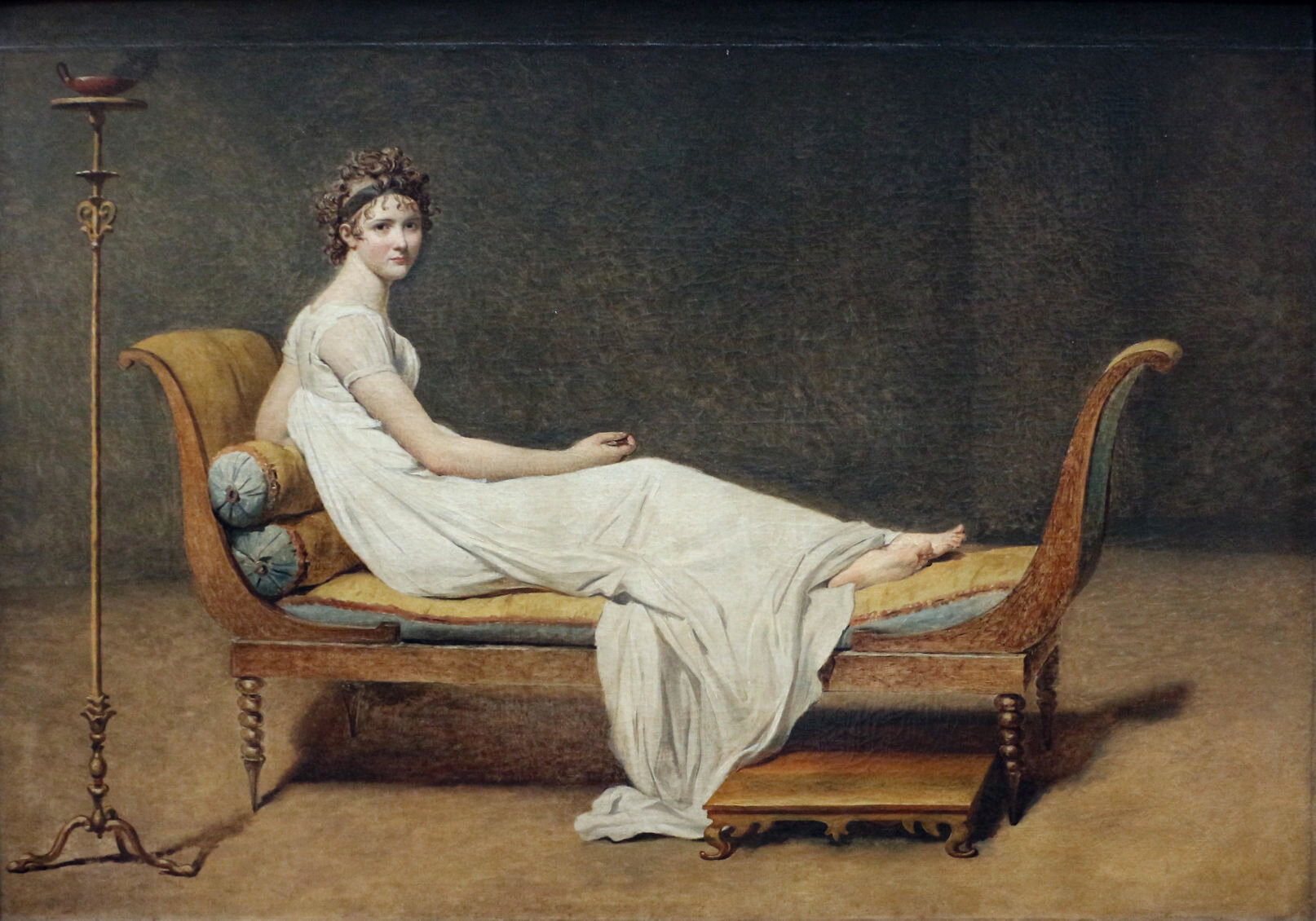
Art history: Jacques Louis David was the first significant painter of French classicism and later became one of Napoleon’s favourites. His portrait of Madame Récamier with its
captivating style and the vibrant, unique painting method of the background is an outstanding piece of art. Julie or Juliette Récamier (originally Jeanne-Françoise Julie Adélaïde Bernard) was a leading figure of early 19th century literary and political society.
Juliette opened a salon as a meeting place for a select group of people.
The beautiful young lady was surrounded by adorers. She was among the first ones to furnish her residence in an Etruscan style. She was wearing antique clothes at the time of the Directory contributing to the popularity of the antique style during imperial rule.
Her salon played a significant role in the political-intellectual life of the era.
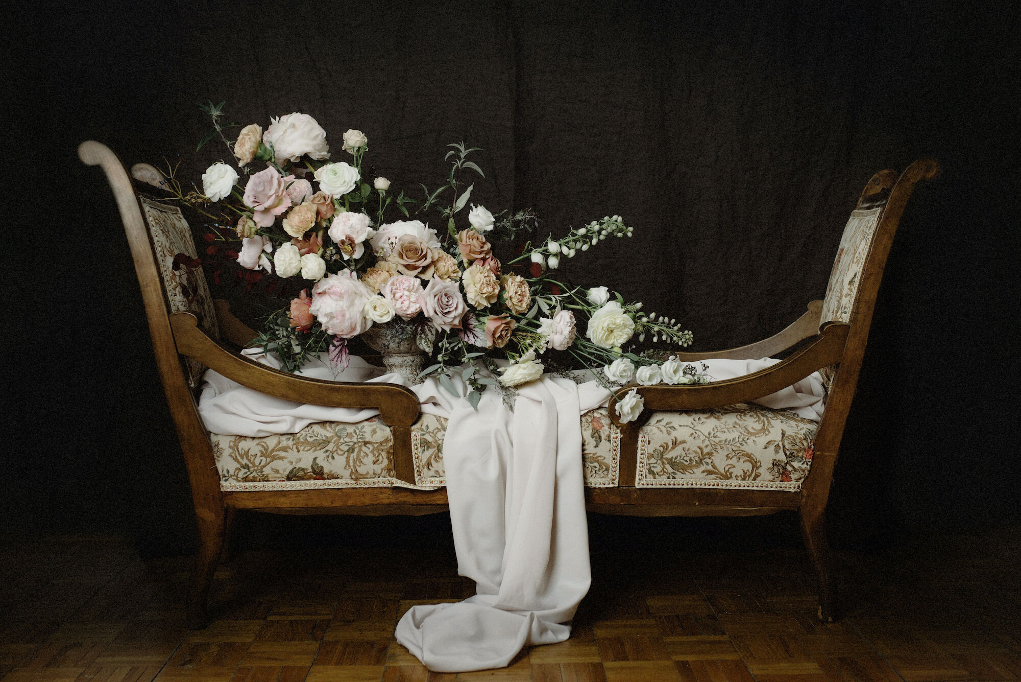
Floral design: Madame Récamier is represented by soft, gentle flowers resembling her character and graceful beauty, such as David Austin roses, Lisianthuses, Digitalises and Ranunculuses. The figure of the lying lady is outlined by a stretched-out composition. A textile material completes the arrangement to underline the association.
Photography: The light in the painting comes in from one point in the centre top. We used two lamps in the middle and raised the stronger light source to achieve a similar effect for the arrangement. The brush technique in the painting is gentle on the figure of the Madame but more rough on the surroundings. This texture is marked by increased grain, while the gripping difference between light and shadow in the painting is recreated by the significantly increased contrast.
THE VIRGIN OF THE ANNUNCIATION
FRA ANGELICO, 1440–1445
Art history:
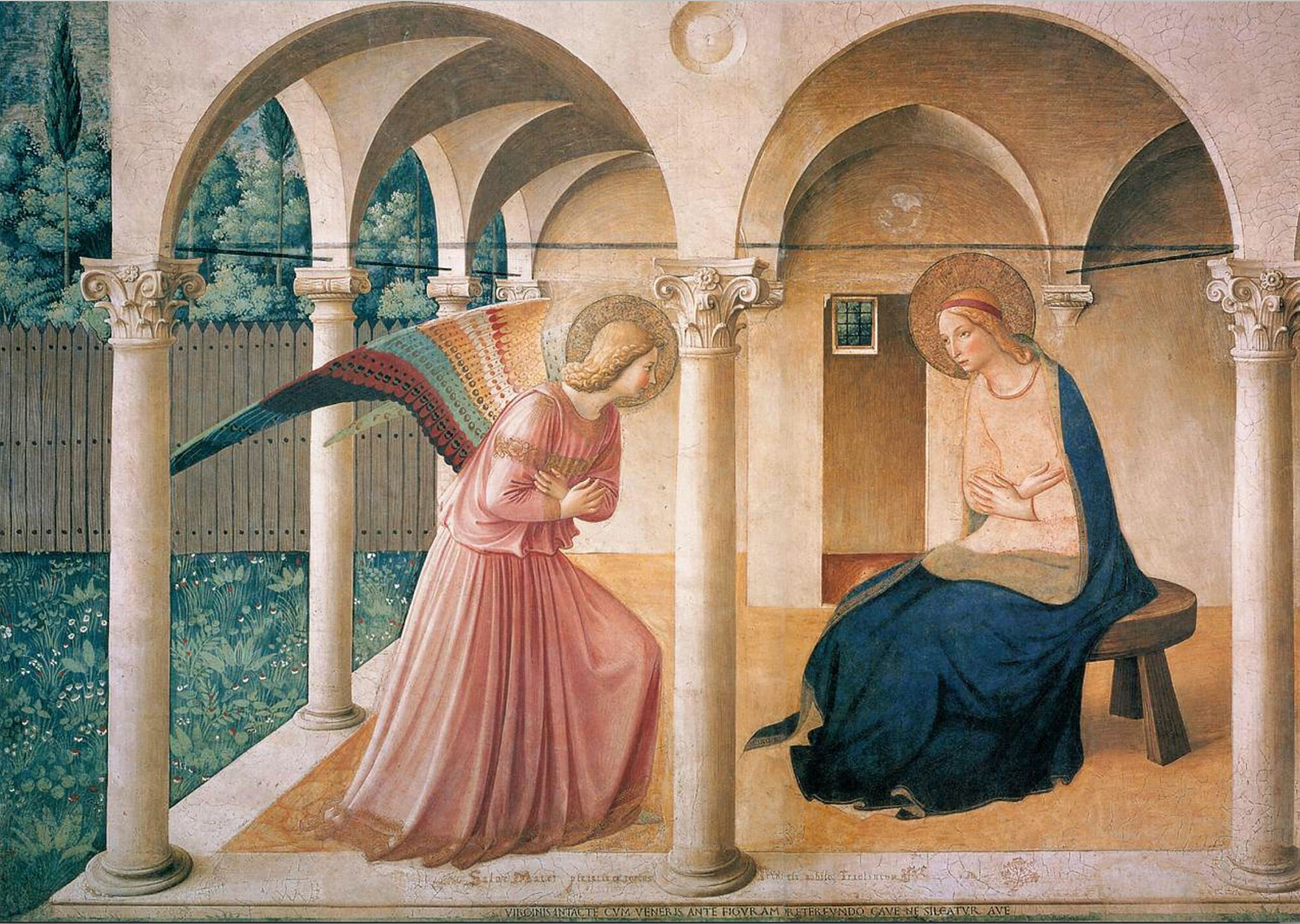
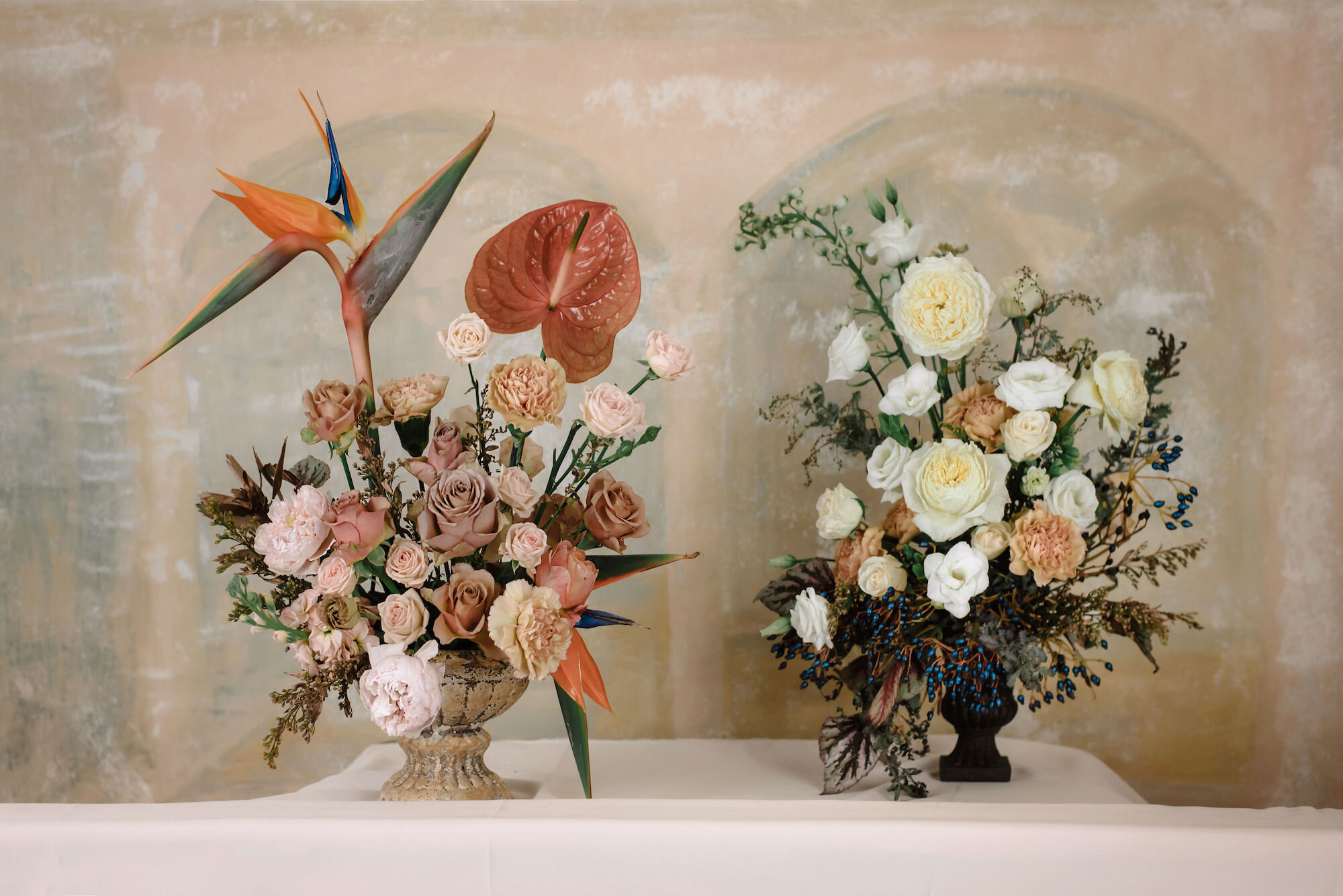
Fra Angelico is also known as the painter of Annunciations. This particular piece of art depicts the angel Gabriel and the Virgin Mary at the moment of the Annunciation. We wanted to outline the angel entering the building where the Virgin Mary is sitting. The composition recreates their posture and location.
Floral design: Our main aim was to imitate the colours characterising Fra Angelico’s painting style. The attention of the Virgin Mary and the angel towards each other is marked by the location and the angle of the flowers: garden roses, Lisianthuses and small-headed roses to reflect the gentle and sensitive nature of the figures. We marked the angel’s wing with a crane flower, which we also used to keep the composition in balance and to represent the kneeling leg of the angel entering the room. The Virgin Mary’s blue dress is made out of the radiant blue fruit of Viburnum and silver-leafed Begonias.
Photography: In Fra Angelico’s painting, the light comes in from behind the angel on the left side. We lighted the arrangement with two constant lights from the left and brightened it from the opposite side to preserve the sunlit effect of the original painting. Despite clear contour lines, the painting is characterised by low contrast with pastel
colours creating a gentle harmony. This atmosphere was recreated by desaturation, increasing sharpness and softening clarity and contrast during post-processing.

